Wednesday, March 20, 2013

Lab 8- Final


August and September are the driest and hottest months, in Los Angeles's Mediterranean climate. This makes several areas very vulnerable to fires which can be uncontrollable. This is what led to Los Angeles's largest fire and the nations 7th largest since 2000.

It started in the afternoon of August 27,  in the Angeles National Forest. The afternoon of August 26 is when the first account of a fire starting at a nearby fire station, Angeles Crest Fire Station. The fire affected approximately 160,500 acres and caused great alarm and evacuation of nearby residents. With effects of the wind and the Forest providing a great fuel for a wildfire, the fire spread North, North East and North West.

The recovery of this fire will take several years for the watershed to stabilize. Overall the animal species should be able to stabilize as well. The terrestrial area will of course take much longer, due to soil conditions.

There were over 1,000 firefighters helping with the spread of the Morris Fire. Unfortunately, two passed away due to an accident of going off road during the wildfire. Overall the, Angeles Forest did have up-to-date plans and protocol for fires, but it was unable to help the two that lost their lives. They made great progress the first few hours, unfortuanley the location of the fire department restricted their access to putting out the fire and made it difficult.

There were about 2,800 fire personnel , 12 helicopter and 8 air tankers trying to put out the fire.

The fire had made surrounding areas of Los Angles even hotter, with temperatures reaching triple digits. No civillians were reported dead but 29 total were injured (including fire personnel). 89 residences were destroyed and 18 residences damaged. 6,600 homes (10,000 people) were evacuated and 12,000 homes were threatened to be evacuated.


If the fire had gone West or South, it would have disturbed a greater number of people along with hospital and health care access. Fortunately no hospital was directly affected. Although due to the fire, roads and freeways close to the fire were shut down. That could have led to some logistical difficulties. Because 45% of the fire was put out by August 27th (Day 2). Overall, the fire did not have too large of an impact on hospitals because of their locations.


Bibliography
USDA, 11/13/2009. http://www.fs.fed.us/fire/station_fire_report.pdf 

NOAA (National Oceanic and Atmospheric Association), 01/08/10. http://www.ncdc.noaa.gov/sotc/fire/2009/13

Fish and Wildlife. 9/2009. Leslie Welch, Dan Teater, Robin Eliason. http://www.fs.usda.gov/Internet/FSE_DOCUMENTS/stelprdb5167065.pdf

NASA Earth Observatory, 09/31/2009. http://earthobservatory.nasa.gov/NaturalHazards/view.php?id=40011


Media-
Pasadena Star News, 08/27/2009.  http://www.pasadenastarnews.com/news/ci_13211554

Los Angeles Times, 08/31/2009. Genaro Molina. http://latimesblogs.latimes.com/lanow/2009/08/la-county-fire-doubles-in-size-more-homes-list-mt-wilson-threatened.html


Friday, March 1, 2013

Week 8- Lab 7- Census Data


This census map shows that the majority of the African American population lives in the South East continental US.  They live more inland than in along the coast. Also there is a significant scatter around the general eastern half of the country and by the South West- California, Arizona area. This makes sense, since historically these are the areas Blacks were originally brought during the 1700 -1800s.


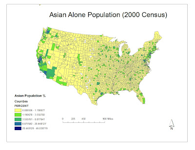
This map shows the Asian population in the continental US. It shows that Asian populations are predominately in the West Coast of the nation. This makes sense because the West Coast is on the other side of the Pacific Ocean, so logistically, this area was the most feasible. There are very few amounts spread through out the Midwest as well as in the South, except for the larger cities. There is also a decent population in the East coast- New England area. There are also pockets along Florida.

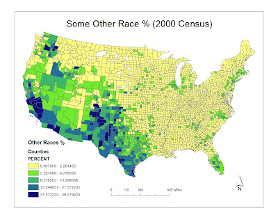
The Some Other Race population mostly lives in the West and South West areas of the nation. High populations live along the Mexico-America border. This can lead to the assumption that it is most likely a Hispanic population being shown. There is also a significant population in the southern tip of Florida as well as some scattered areas in the East Coast. The rest of the nation is mostly unpopulated by the Some Other Race, according to the 2000 Census.


Overall, ARC GIS has made data much more understandable. Before it was all in an excel sheet, which was hard to understand and imagine. Mapping it out, shows where the populations are mostly located in a viewer-friendly manner. The different options of shading effects also makes the information more digestible. ArcGIS is has also been helpful, because in one program I was able to convert file formats into graphable and map-able data. This was very helpful, because otherwise I would have to manually add all the information which would have been very time consuming and unproductive.


Wednesday, February 20, 2013

Week 7- Lab 6 Elevation map

This is a 2D image of a 3D map created on ArcScene


 The benefits of using ArcMaps for mapping elevation is that it clearly shows the change in elevation. It also helps show which variable in elevation difference you need. ArcScene was very helpful in rendering a 3D model. This gives a good visual representation in how the elevations look in different areas. One of the pitfalls is how easily your map can change by having  your data layers in the wrong order. That can easily misrepresent accurate information from the data layers.

The DEM (Digital Elevation Models) was downloaded form the class website.

Week 6 (lab 5) Map Projections


    Conformal, equidistant and equal-area projection maps each have their own pros and cons. The main benefit of 

    Wednesday, January 30, 2013

    Week 4: Arc Map Tutorial

    Arc GIS is an amazingly helpful software. It allows the function of combining several types of data of a geographic location. Using ARCMaps for the first time is challenging. By following the brochure, it took a long time to create the final map. However if followed correctly there were no issues. When followed incorrectly it often didn't become apparent until a few steps later, there fore it was time consuming and difficult to pinpoint the last error.

    Arc GIS has a lot of potential. It allows for the creator to consider several variables, giving the freedom to make it as complex or simple. Also it is also helpful because of the Excel type functions it has. You can extrapolate the data creating graphs, charts and so on with the information. This allows for the map to be as thorough as possible. It is also an efficient way to show your data and information, all on one page. Also, with the information provided, GIS software can also make predictions. This has ample benefits for studying and establishing trends. Although difficult at first, the continuous use and repetitive actions makes it helpful to quickly remember actions and commands. Another good point of this, is how you can easily edit/modify the information. By changing and adding number/information it will modify your existing map accordingly.

    Some of the negative aspects and pitfalls is the reliance on databases. Of course none of the commands would work without the data layers, because that is the information. but one error in the database can not only skew but completely mess up the map. Also, at certain times, I found myself frustrated with the many toolbars. I had to keep several open at a time, and when it came time to zoom in and out, change scale, etc, I had difficulties. By the end of it I got it down, but in the beginning I spent more time than necessary trying to fix sizes, scales etc.

    Over all, GIS has many benefits. Overtime, with future software updates, it will become even more user-friendly. It already has so many benefits and is used so frequently, that most people underestimate is true value and potential. Eventually learning how to use GIS software might become something even high school-ers will even learn to use, because of its many benefits.

    Wednesday, January 23, 2013

    Week 3: Digital Mapping

    whenever you use a tool
    it gives you a but of freedom
    participating in how the world should look,
    put limits on how you can personalize

    5 place marks
    one route
    one shape
    one embedded picture
    one embedded link
    one embedded video

    https://maps.google.com/maps/ms?msid=216154049483233420066.0004d3fb6f0d7cde94d83&msa=0&ll=48.872167,2.770014&spn=0.039687,0.090895


    Wednesday, January 16, 2013

    Week 2: USGS Topo Map

    1. What is the name of the quadrangle?
    Beverly Hills Quadrangle

    2. What are the names of the adjacent quadrangles? 
    Canoga Park, Van Nuys, Burbank, Topanga, Hollywood, Venice, Inglewood

    3. When was the quadrangle first created? 
    1966

    4. What datum was used to create your map?
    Horizontal: North American Datum (NAD) of 1927 Vertical: National Geodetic Vertical Datum of 1929
    5. What is the scale of the map? 
    1:24,000
    6. At the above scale, answer the following:
    a) 5 centimeters on the map is equivalent to how many meters on the ground?1/24,000=5/X= 1,200 meters

    b) 5 inches on the map is equivalent to how many miles on the ground?1/24,000=5/X=  *63360=1.894 miles

    c) one mile on the ground is equivalent to how many inches on the map?2.64 inches

    d) three kilometers on the ground is equivalent to how many centimeters on the map? 3km*24000=72,000

    7. What is the contour interval on your map?
    20 feet

    8. What are the approximate geographic coordinates in both degrees/minutes/seconds and decimal degrees of: http://transition.fcc.gov/mb/audio/bickel/DDDMMSS-decimal.html
    a) the Public Affairs Building; 
    34°4'20"N,118°27'0"W       34.072222°N,118.45°W
    b) the tip of Santa Monica pier; 
    34°0'50"N,118°29'56"W     34.013889°N,118.449°W
    c) the Upper Franklin Canyon Reservoir; 
    34°7'10"N,118°24'30"W    34.119444°N,118.408333°W

    9. What is the approximate elevation in both feet and meters of:
     a) Greystone Mansion (in Greystone Park);
      550 ft/167.68m
    b) Woodlawn Cemetery;
       140ft/42.6m
    c) Crestwood Hills Park;
        800ft/243.90m

    10. What is the UTM zone of the map?
    It is zone 11.

    11. What are the UTM coordinates for the lower left corner of your map?
    361500mE, 3763000mN

    12. How many square meters are contained within each cell (square) of the UTM gridlines?
    each cell (square) has 1,000,000 m2

    13. Obtain elevation measurements, from west to east along the UTM northing 3771000, where the eastings of the UTM grid intersect the northing. Create an elevation profile using these measurements in Excel (hint: create a line chart). Figure out how to label the elevation values to the two measurements on campus. Insert your elevation profile as a graphic in your blog.


    14. What is the magnetic declination of the map?
    14°

    15. In which direction does water flow in the intermittent stream between the 405 freeway and Stone Canyon Reservoir?
    the water flows from North to South in the intermittent stream between the 405 and Stone Canyon Reservoir.

    16. Crop out (i.e., cut and paste) UCLA from the map and include it as a graphic on your blog.